On this page you can find instructions on how the contents (views) of the visualisation of the core vocabulary can be changed.
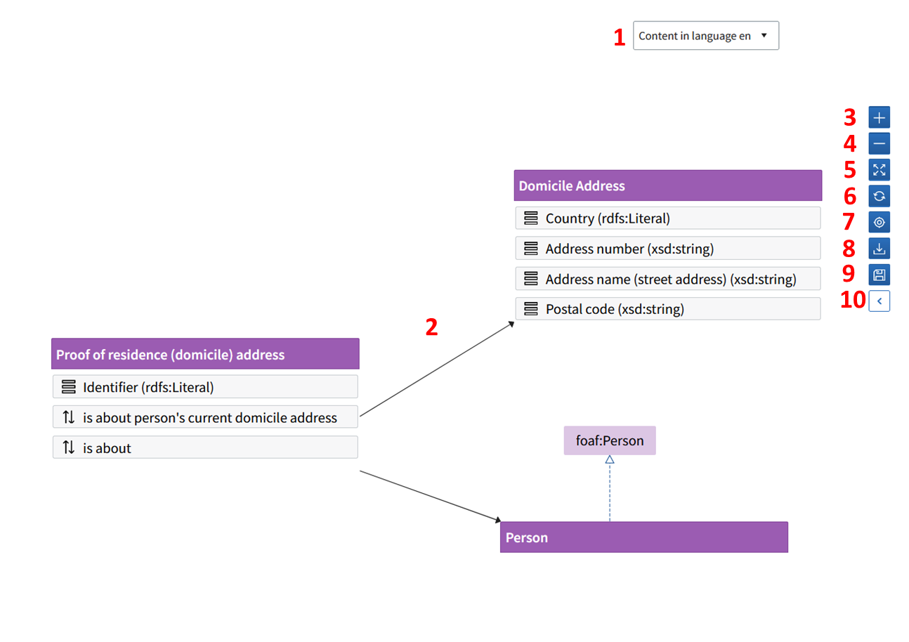
- Choose the language from the Content in language drop-down menu in the upper right corner. The language is used in the content descriptions and in the visualisation.
- The classes of a data vocabulary are shown in purple. If you choose a class from the visualisation or the left side panel, it will be highlighted with orange.
- To enlarge the visualisation, zoom in by clicking the plus button.
- To reduce the visualisation, zoom out by clicking the minus button.
- Spread the visualisation to a full screen view.
- Reset the view (Refresh-function).
- Zoom the selected class to the middle of the view.
- Download the visualisation to your computer as a picture file in png format.
- Save the positions of the classes. Note! This function is only shown to a user who has data modeler rights in the contributor organisation.
- Other users can change the position of the class in the visualisation, but this change will not be saved when the user exits the tool.
- Click the chevron to open the Graph settings tab, where you can change the settings of the visualisation.
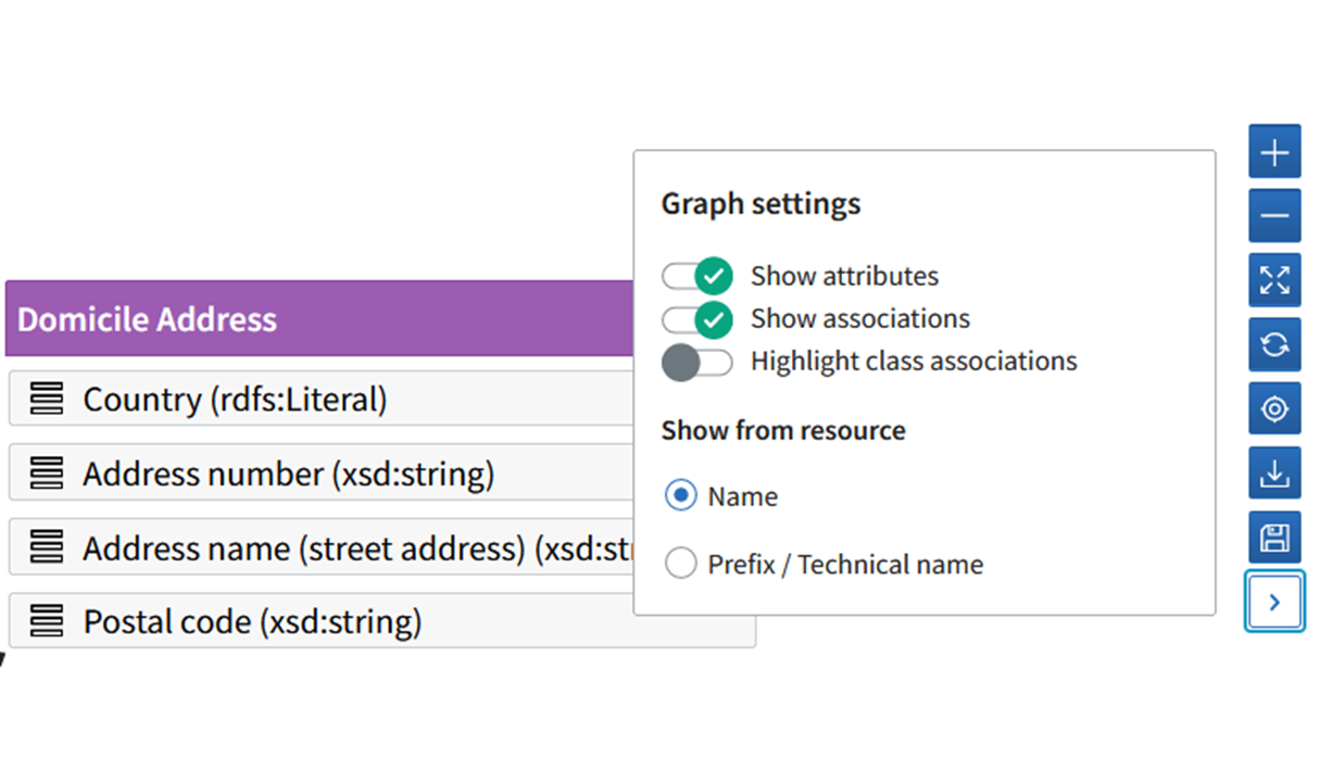
Use the switches in the Graph settings menu to change the view settings:
- Show/hide the attributes under the class title
- Show/hide the associations under the class title.
- Highlight/hide the class associations.
With the Show from resource function you can toggle the visualisation to show either the name (for example, requires) or the technical, machine-readable name (for example, fi-eauth:requires)